
프론트킷 frontkit
Super Green Cleanse
슈퍼 그린 클렌즈
슈퍼 그린 클렌즈
Brand Identity | Graphic | Package
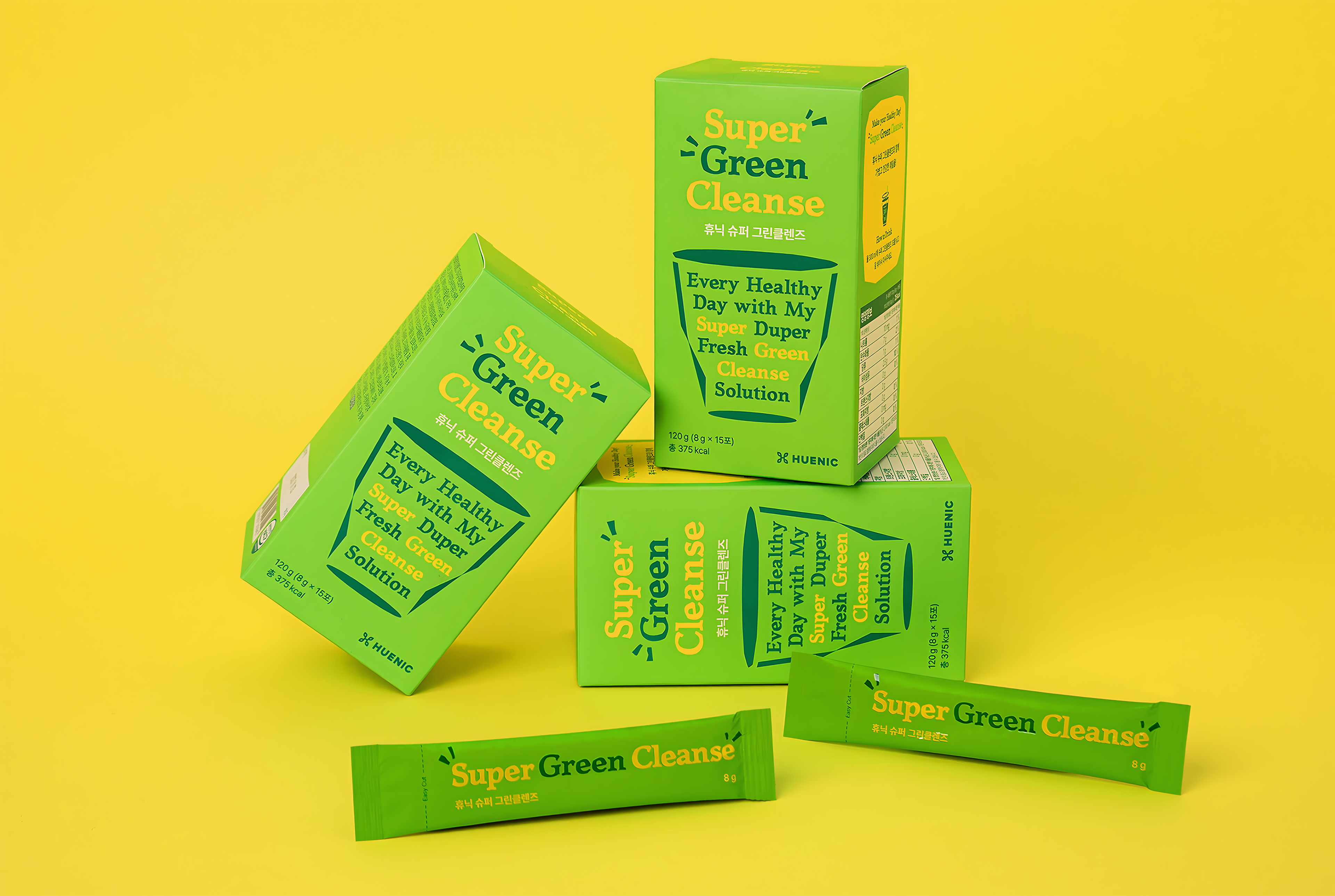
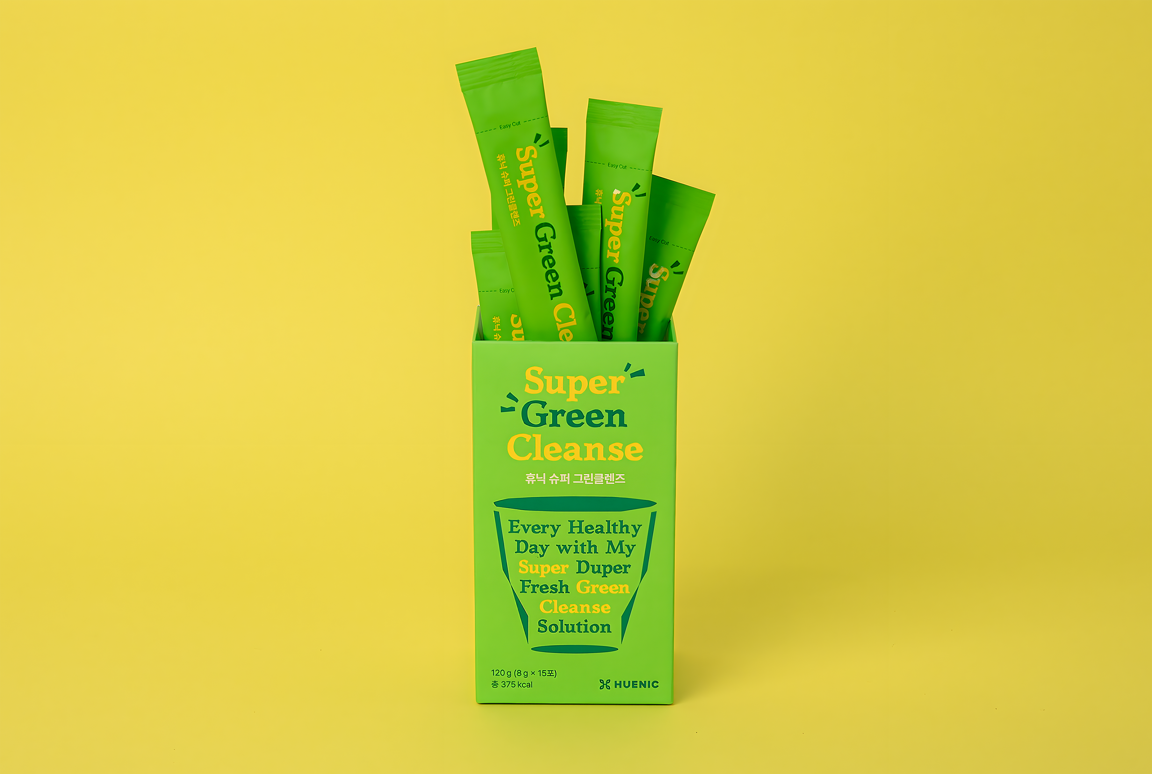
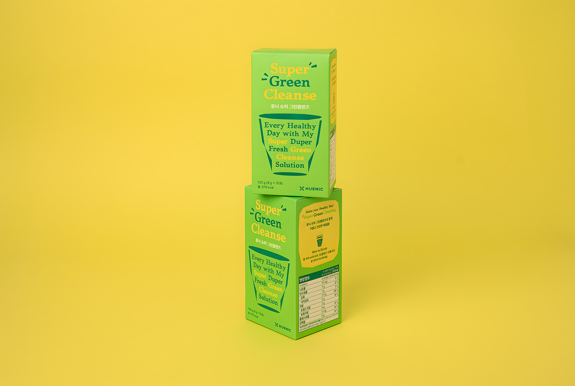
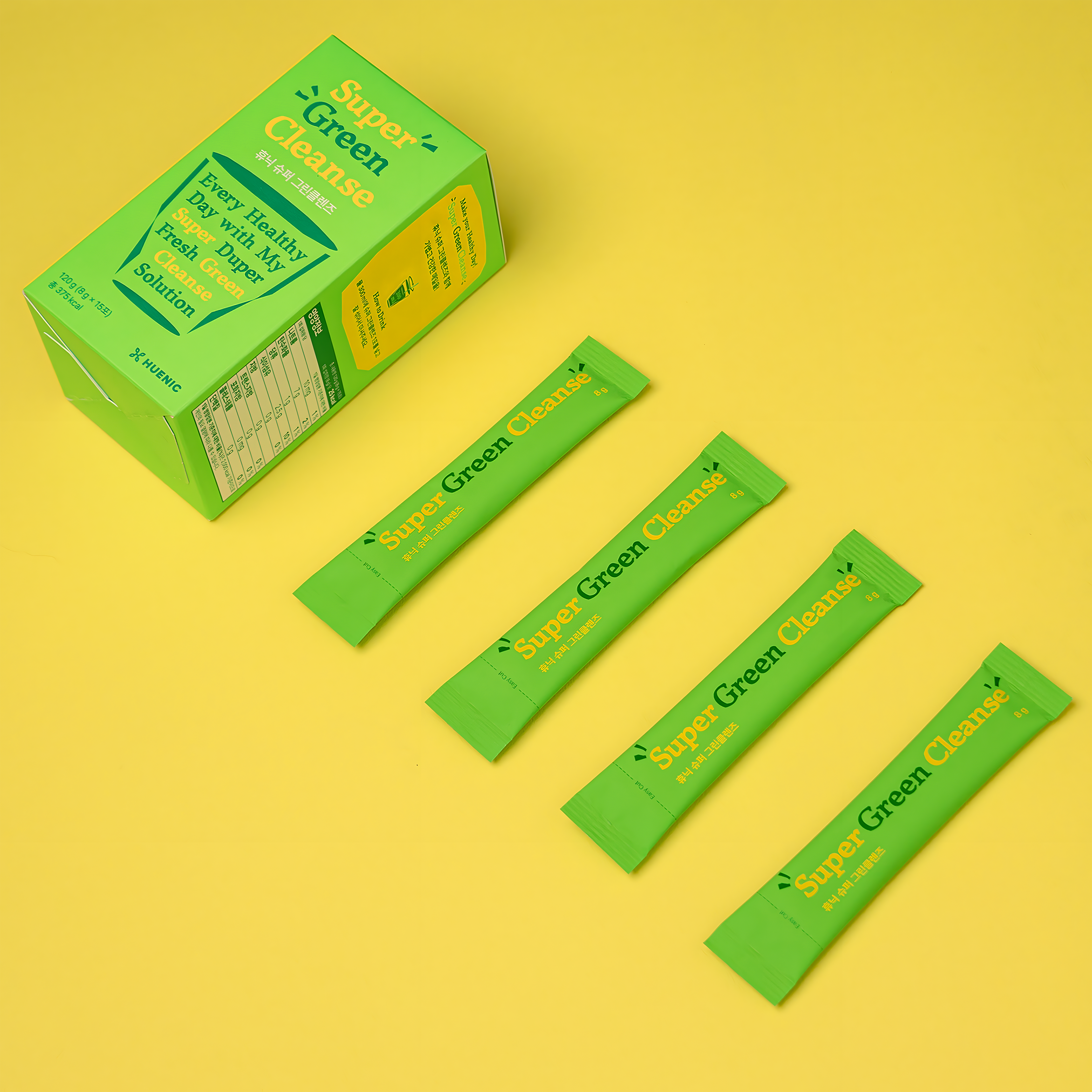
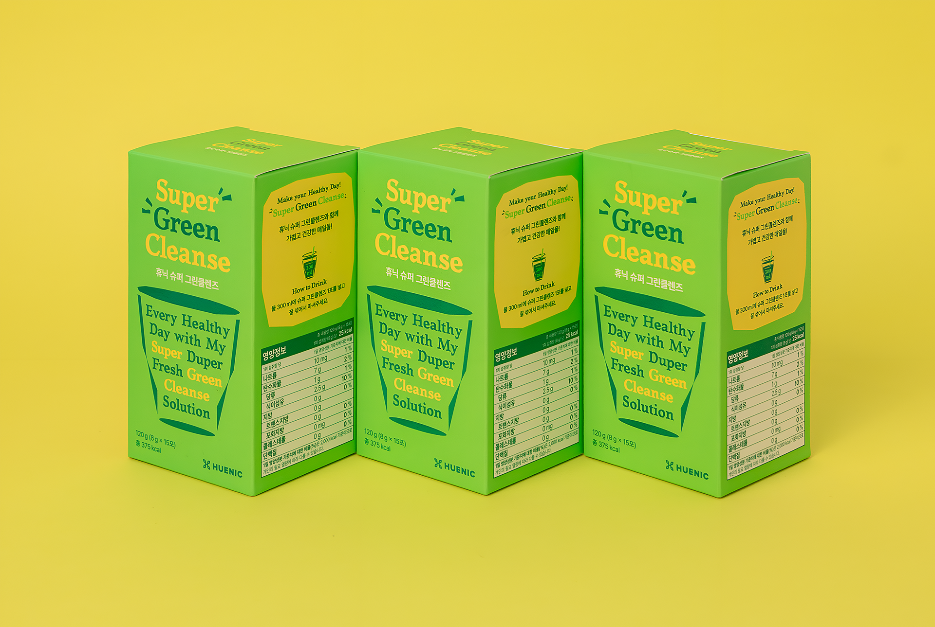
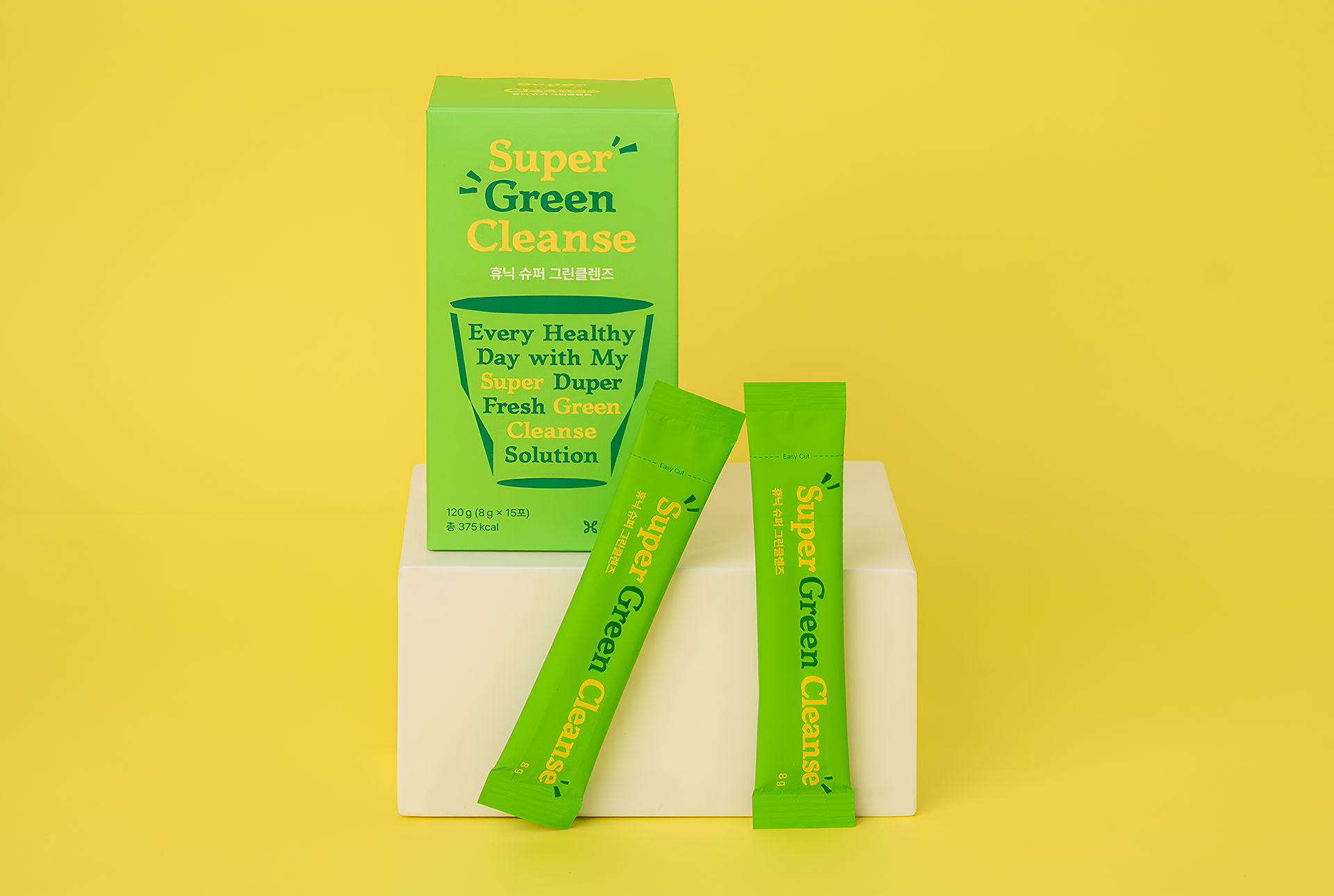
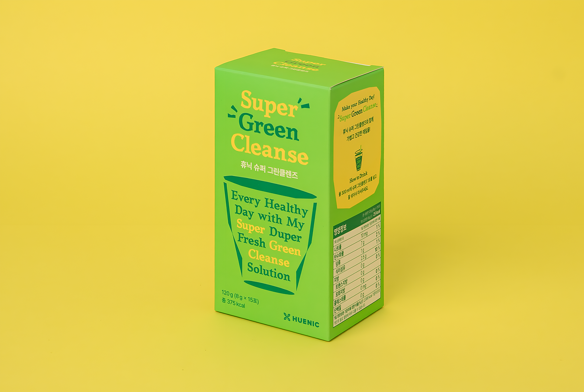
Front Kit designed the packaging for Super Green Cleanse, a wellness product by Huenic. The key visual highlights plant-based nutrients and dietary fiber contained in a single cup, clearly communicating the product’s concept as a drinkable cleanse.
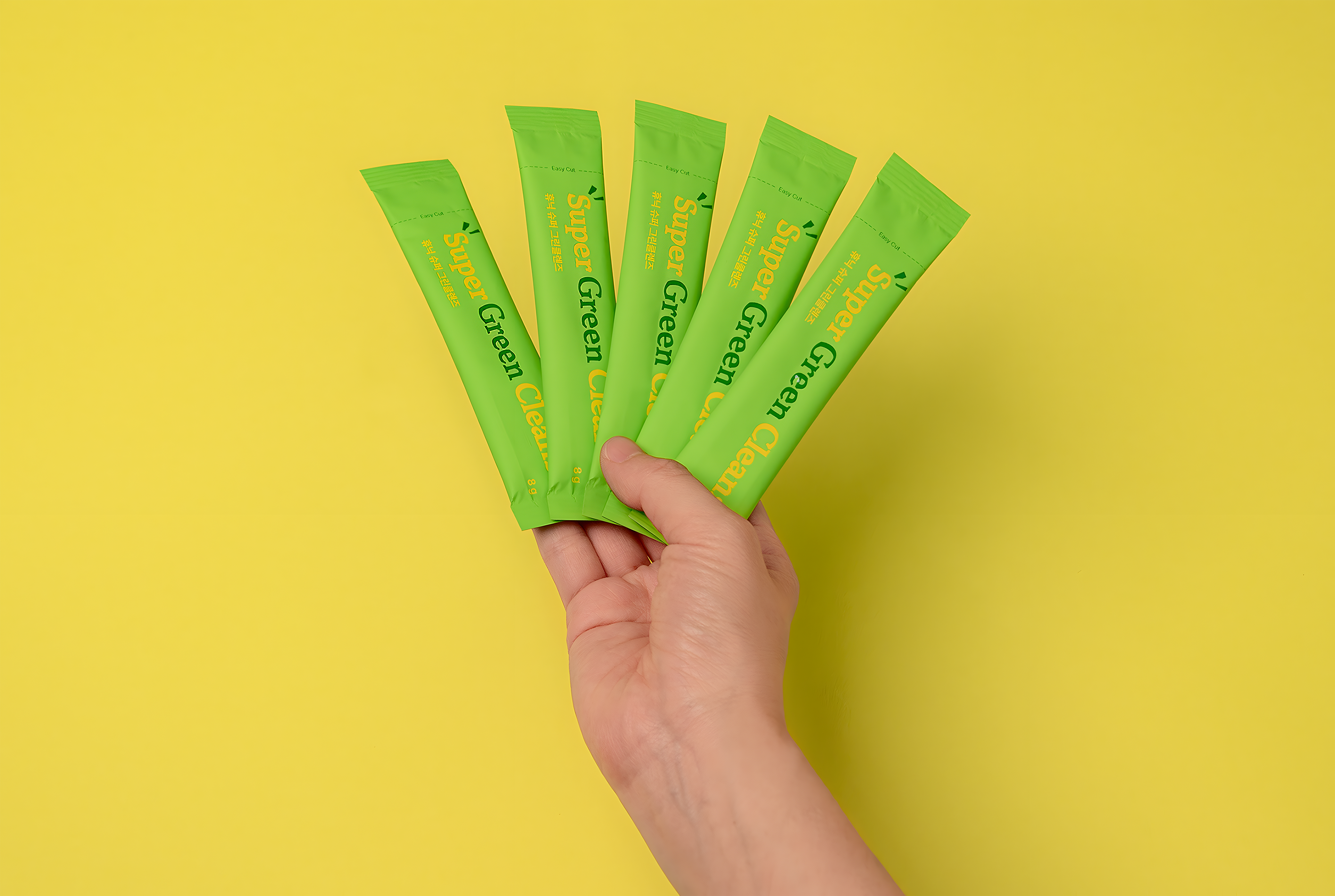
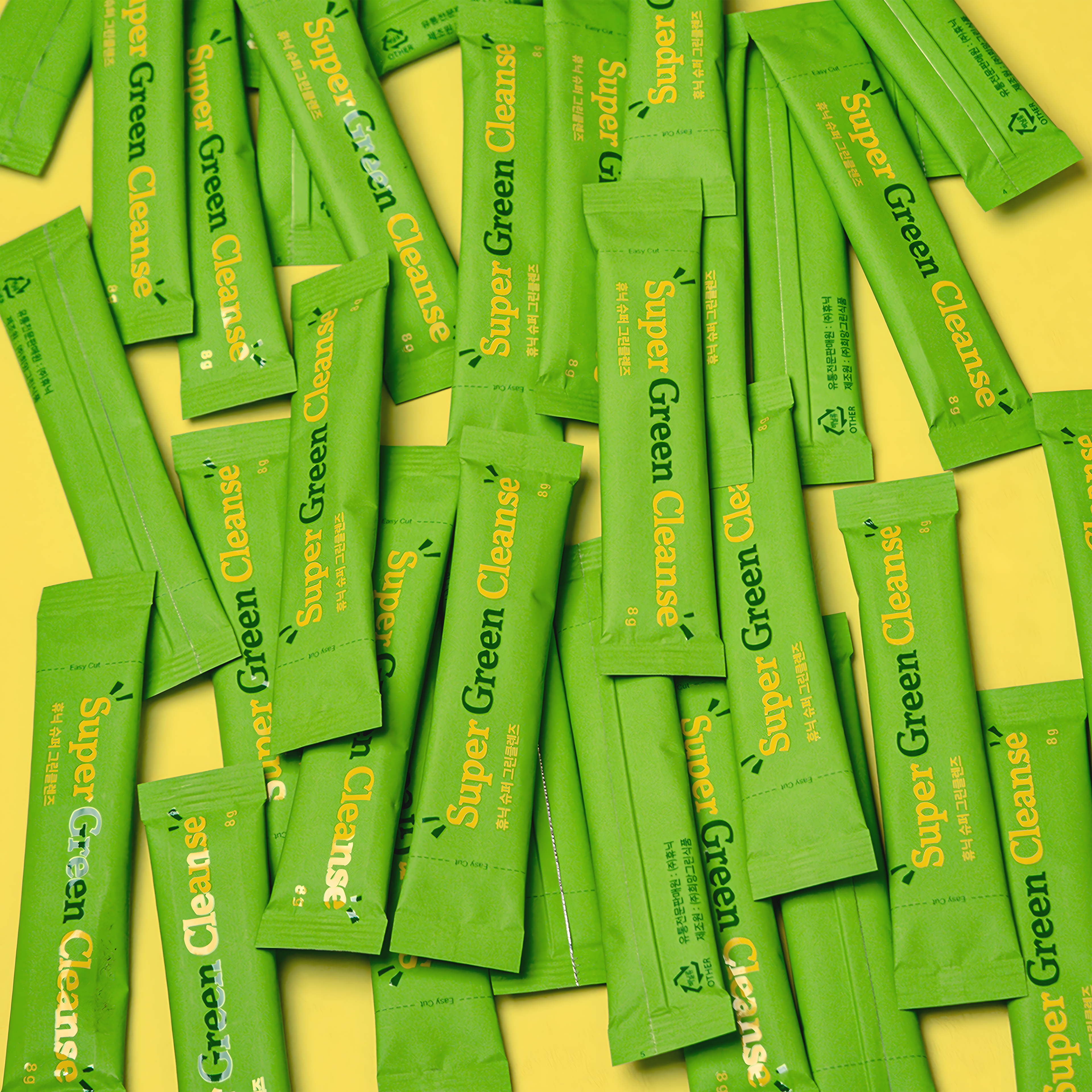
A bright lime-toned color palette reinforces a vibrant and casual mood, reflecting an approachable wellness lifestyle. The design successfully delivers the brand message of self-cultivated healthy habits while strengthening a positive and contemporary brand image.
웰니스 기업 휴닉(Huenic)의 슈퍼 그린클렌즈 패키지 디자인을 진행하였습니다.
한 컵에 담긴 식물성 영양소와 식이섬유를 시각적으로 표현한 키비주얼을 통해, 음료처럼 간편하게 마시는 클렌즈 제품의 특성을 직관적으로 전달하고자 했습니다.
한 컵에 담긴 식물성 영양소와 식이섬유를 시각적으로 표현한 키비주얼을 통해, 음료처럼 간편하게 마시는 클렌즈 제품의 특성을 직관적으로 전달하고자 했습니다.
밝은 라임 계열의 컬러 팔레트는 활기차고 캐주얼한 인상을 부여하며, 일상 속에서 부담 없이 실천할 수 있는 웰니스 브랜드의 태도를 드러냅니다. 이를 통해 ‘스스로 만들어가는 건강한 습관’이라는 브랜드 메시지와 긍정적이고 트렌디한 이미지를 효과적으로 확장하였습니다.

Client
Huenic huenic.com
PM & Brand Strategy
HIZ hizsite.com
Huenic huenic.com
PM & Brand Strategy
HIZ hizsite.com
Design
FRONT KIT frontkit.co.kr
FRONT KIT frontkit.co.kr
Art Direction
Min Ah Hong
Min Ah Hong
Design
Yun Woo Shin, Hyeok Kim, Jung In Lee
Yun Woo Shin, Hyeok Kim, Jung In Lee
Photography
Yun Woo Shin, Hyeok Kim
Yun Woo Shin, Hyeok Kim